Corporate Memphis: how each generation rewrites design rules
Contents
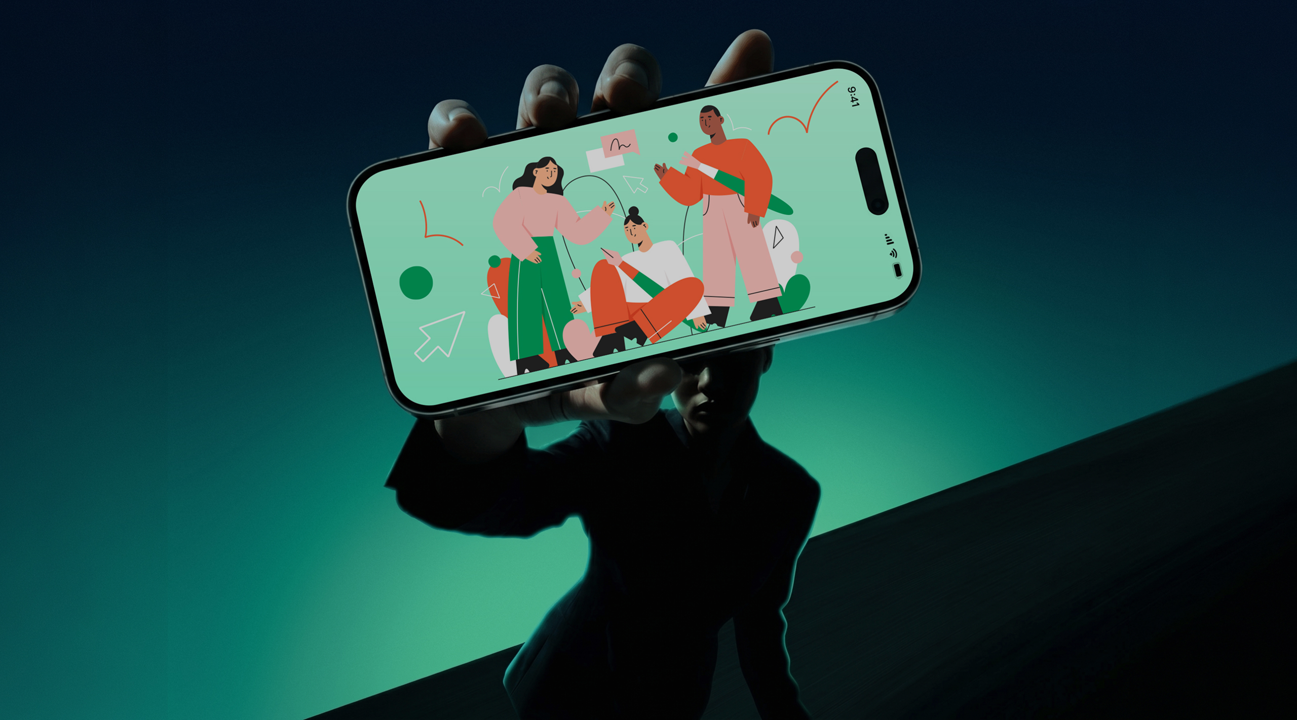
There is an illustration style that you have seen thousands of times without ever knowing what his name was. Characters with disproportionately long limbs, tiny heads, blue or purple skin. Always smiling, always moving, always in flat decorations with pastel colours. You crossed them on Slack, Airbnb, Dropbox, Mailchimp, Figma, Google, Facebook. On posters in the subway, landing pages, onboarding apps. This style has a name: Corporate Memphis. And his story says a lot about how design, in reality, was never just a discipline. It's a social mirror.
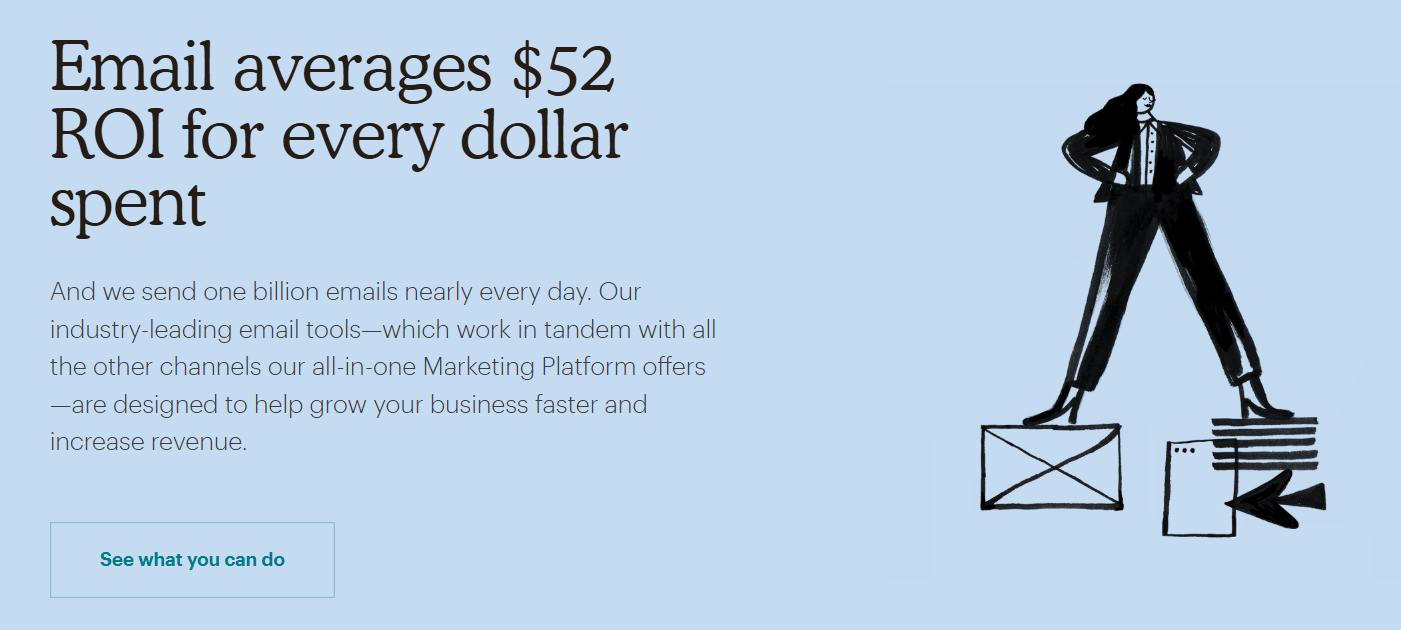
Example of Corporate Memphis illustrations. This flat style to characters with elongated members dominated the visuals of tech companies between 2017 and 2022. Source: Mailchimp 2019
From Milan apartment to Silicon Valley
To understand the Corporate Memphis, it is necessary to go back to December 11, 1980, in the salon of Ettore Sottsass, Italian architect and designer. That night, twenty or so designers met to discuss the future of design. In the background, Bob Dylan's song "Stuck Inside of Mobile with the Memphis Blues Again" is looping on the record. The nascent group takes this name, Memphis, evoking both the American blues capital, the city of Tennessee and the former capital of Egypt.
The Memphis Group is a revolt against modernism. Sottsass and his collaborators are bored by the clean lines and austerity of post-war design. They want something radically different: bright geometric shapes, almost two-dimensional, a playful, almost childish feeling. Furniture, luminaires, textiles: the group produces baroque, colourful, deliberately extravagant objects. Critic Bertrand Pellegrin sums it up in the San Francisco Chronicle: "a forced marriage between Bauhaus and Fisher-Price". The group dissolved in 1987, not without having defined all the aesthetics of the 1980s.
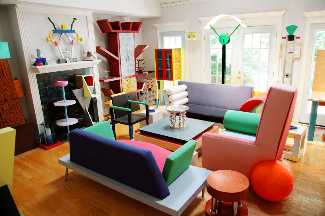
Ettore Sottsass for the Memphis Group. Geometric shapes, saturated colours, total break with functionalist modernism. Source: Museum of Decorative Arts, Paris / Wikimedia
Forty years later, this visual language resurfaces in a radically different context. The term "Corporate Memphis" is forged by Mike Merrill, a creative and advertising expert, to describe a flat and standardized style of illustration that begins to dominate the visuals of tech companies. The reference to the Memphis Group of the 1980s is intentional, but critical: same visual energy, but asepticated, duplicated to infinity, emptied of its original subversion.
2013-2017: when tech marketing discovers that it is necessary to be human
To understand why this style explodes in the late 2010s, it is necessary to understand what is happening in digital interfaces a few years earlier. Until 2013, digital design works on a principle called skeomorrhism: icons and interfaces mimic real-world objects. The camera icon looks like a real camera, the notebook looks like a real notebook.
Apple catalyzes the breakup in 2013 with iOS 7, abandoning this aesthetic for more flat and sleek shapes. The rest of the industry follows.
The flat design is installed. Interfaces become lighter, more legible. But also colder. And at that time, the SaaS B2B market entered a phase of hypergrowth: dozens of tools landed, targeting marketing teams, HR, finance, product. The problem: these tools are seen as complex, austere, reserved for technical profiles.

UI style skeuomorphism on Google 2010 interfaces
Millennials arrive in mass on the buyer teams. They grew up with the internet, they have a strong expectation of warm and accessible experiences. They want tools similar to them. Friendly tools.
In 2017, Facebook ordered a complete illustration system called "Alegría" in Spanish from the American design studio BUCK. Colourful characters, ethnically ambiguous, without defined traits, in everyday scenes. A way to represent the human without excluding anyone. Competitors and startups observe, copy, adapt. Slack entrusts illustrator Alice Lee with the creation of a library of more than 40 visuals with characters with elongated limbs and minimalist features. Airbnb, Dropbox, Google, Lyft, Hinge, Airtable, Figma, Mailchimp: the style is spreading throughout the tech industry.
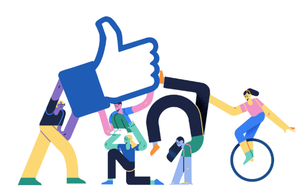
"Alegria" design kit for Facebook by BUCK agency
And open source template libraries like UnDraw or Humaaans do the rest: any startup can now afford a "human" visual identity within a few hours, without briefering a single illustrator.
Breathlessness: When everyone looks alike
The problem with a trend adopted by everyone is that it ends up saying nothing. The Corporate Memphis, conceived to humanize, has become the symbol of dehumanization through standardization.
Its nicknames say "Globohomo" for globalized homogenization, "Big Tech Art Style", "Humanist Blandcore", "Neoliberal Vector Minimalism".
He is accused of having created a visual world disconnected from the reality of the companies that use it. A world of aseptic optimism that contrasts with data scandals, opaque practices, a little glamourous gig economy. By wanting to talk to everyone, style doesn't talk to anyone anymore.
Saturation is total around 2020-2022. One can no longer distinguish a SaaS from another on their homepage. The first companies to move away from it begin to stand out simply by doing something else: back to 3D, more expressive characters, soft skeomorphism revisited, mascots, destructured typographies.
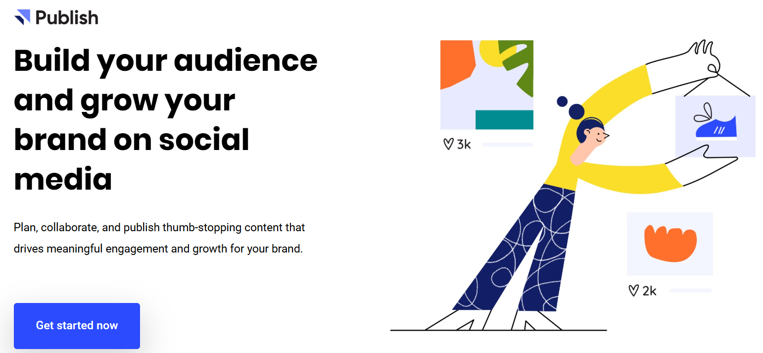
Buffer - 2020
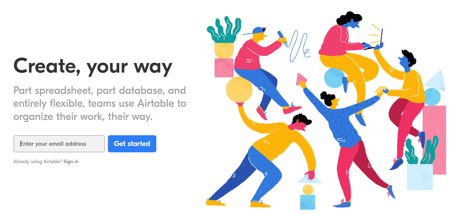
Airable - 2020

Uber - 2020
What design says about us
Corporate Memphis was much more than an aesthetic choice. It was the mirror of a generation of buyers who wanted tools similar to them. The mascots and the return to expressive characters in branding is the same logic reformulated for Gen Z.
And the brands that understood it earlier are those that have the strongest communities today. Discord and his ghost Wumpus, Duolingo and his threatening owl, GitHub and his half-pumped half-chat Octocat, Reddit and his man Snoo: so many expressive, memorable mascots with a clean personality. These brands have not chosen a trend.
They built a character who embodies what they are, and Gen Z took it.

Discord - 2026
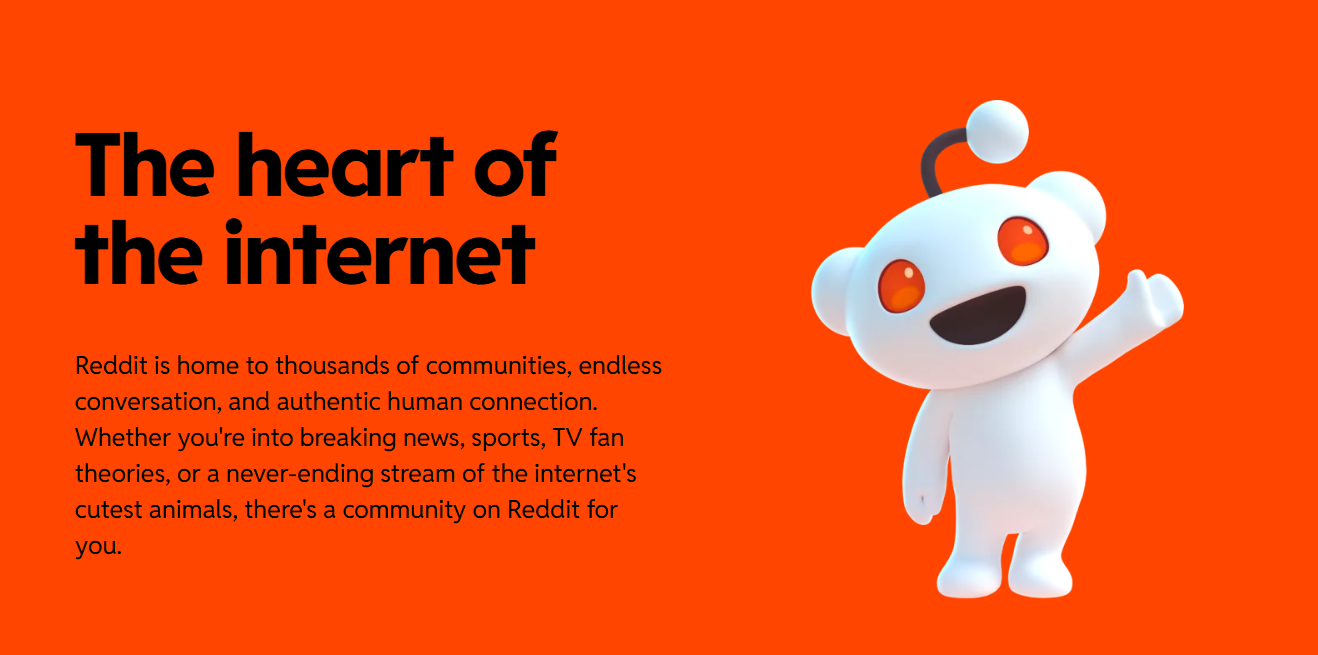
Reddit - 2026

Duolingo - 2026
The difference today is that there is no single successor to Corporate Memphis. What follows him is multiple: Liquid Glass at Apple, back to the photo and the color flats at the great SaaS, mascots and expressive characters for brands that want personality. Different directions, but one thing in common: they all seek to find something distinctive. An identity that belongs to only one brand.
Corporate Memphis had made complex interfaces accessible and human. Except that when everyone adopts the same style, nothing stands out. This is homogenization from the bottom: everyone is legible, nobody is memorable.
Each trend reflects a moment. The Memphis Group of the 1980s responded to the coldness of modernism. The Corporate Memphis responded to the coldness of austere interfaces. What happens now reacts to the saturation of the credits. The design fades and recreates every time a generation changes and what seemed modern starts to look like everyone.
Design changes because people change. What does not change is that the brands that last are those that have dug far enough into their own DNA so as not to need to copy a current trend to exist.
The difference today is that there is no single successor. Corporate Memphis homogenized everything. What succeeds him is multiple: Liquid Glass at Apple, back to the picture and the color flats at the great SaaS, rubber hose for brands that want personality. Different directions, but one thing in common: they all seek to find something distinctive. An identity that belongs to only one brand.
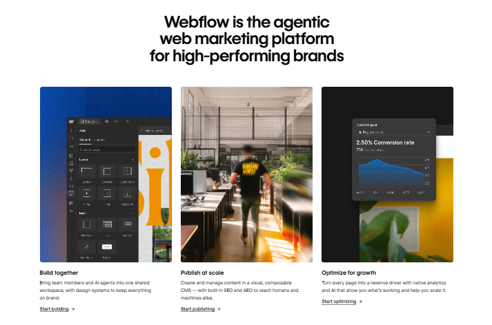
Webflow- 2026
Corporate Memphis had made complex interfaces accessible and human. Except that when everyone adopts the same style, nothing stands out. This is homogenization from the bottom: everyone is legible, nobody is memorable.
Each trend reflects a moment. The Memphis Group of the 1980s responded to the coldness of modernism. The Corporate Memphis responded to the coldness of austere interfaces. What happens now reacts to the saturation of the credits. The design fades and recreates every time a generation changes and what seemed modern starts to look like everyone.
Design changes because people change. What does not change is that the brands that last are those that have dug far enough into their own DNA so as not to need to copy a current trend to exist.
Our exclusive Ebook:Good practices in Graphic Design
Discover the fundamentals, tips and pitfalls to avoid in order to be a graphic professional.